

Understanding Range Markets in Trading
📈 Learn to spot and trade range markets smartly! Understand key traits, tools, and strategies, plus how these differ from trending markets for savvy trading.
Edited By
Emily Walker
Charts are more than just colourful pictures – they’re powerful tools to make sense of numbers quickly. For traders, analysts, advisors, investors, and brokers, knowing how to read and create charts can sharpen insights and guide better decisions.
Visual data representation simplifies complex numbers, turning raw data into understandable shapes and patterns. This can reveal trends, highlight risks, or spot opportunities that tables alone might miss. For instance, a candlestick chart in the stock market helps investors see daily price movements and investor sentiment in one glance.

Different types of charts serve different purposes. Line charts show trends over time, useful for tracking Sensex or Nifty 50 behaviour. Bar charts compare discrete categories, such as quarterly profits across sectors. Pie charts reveal proportions, handy when splitting a portfolio by asset class. Choosing the wrong chart can confuse rather than clarify, so understanding which fits your data is key.
Creating effective charts involves more than plugging numbers into software. You need to ensure scales are accurate, axes labels clear, and colour schemes accessible. Avoid overcrowding charts with too much information, as it overwhelms the viewer. A well-designed chart tells a focused story without distraction.
Visual clarity in charting reduces misinterpretation risks, helping you to spot market shifts and respond swiftly.
This article explores practical ways to select and construct charts that work for you. It highlights common pitfalls to avoid and shares tips to boost the impact of your visual data. Whether analysing trading volumes, monitoring financial reports, or presenting to clients, mastering charting will deepen your grasp and support confident moves in the market.
Charts are more than just colourful pictures; they are practical tools that help traders, analysts, advisors, investors, and brokers make sense of complex data quickly. The ability to visualise data effectively can reveal patterns and trends that numerical tables alone might hide. This section lays the foundation by explaining what charting view means and why it matters in everyday decision-making.
At its core, a charting view is a graphical representation of data designed to simplify understanding. It uses visual elements such as lines, bars, and slices to convey quantities, trends, and relationships. Unlike raw numbers, which can overwhelm, charts provide a snapshot that highlights what’s crucial. For instance, a line chart showing the Sensex movement over a month instantly communicates market momentum, far better than a table filled with daily closing values.
Visual data representation includes all ways of turning numbers and facts into images, such as bar charts, pie charts, scatter plots, and radar charts. Each type serves a purpose depending on the data’s nature and the message you want to send. Traders often rely on candlestick charts to interpret price action, while financial advisors might use pie charts to illustrate portfolio allocation to clients.
Visualising data is critical because it reduces cognitive load and speeds up decision-making. In business, seeing sales trends or market share through charts helps managers spot growth opportunities or areas that need attention. A retailer tracking daily online sales through bar charts can identify which days perform better, enabling smarter stock planning.
In financial markets, quick decisions often separate profits from losses. Charts showing moving averages or volume trends provide actionable insights within seconds. Even in education, students grasp exam performance more clearly when their scores are plotted as trend lines, helping them strategise preparation.
Visual representation of data brings clarity, aiding swift and accurate insights that raw figures alone seldom offer.
By understanding and using charting views effectively, professionals improve not just analysis but communication, making it easier to share findings and decisions with colleagues or clients. Whether it’s tracking stock prices or evaluating sales, visual data forms an essential part of modern analysis and reporting.
Charts are the backbone of data analysis, especially for traders, investors, and analysts who need to grasp information quickly and make informed decisions. Choosing the right chart type is essential because each serves a specific purpose and reflects data differently. Understanding these helps in presenting complex data clearly and spotting trends or anomalies without getting lost.
Bar and column charts work wonders when you want to compare quantities side by side. For instance, a stockbroker analysing monthly sales volumes across different sectors can use column charts to easily see which sector performed better in a specific month. Bars run horizontally while columns go vertical, but both provide a straightforward visual comparison. They’re particularly handy for discrete categories such as comparing quarterly revenues of companies or evaluating the performance of different mutual funds.
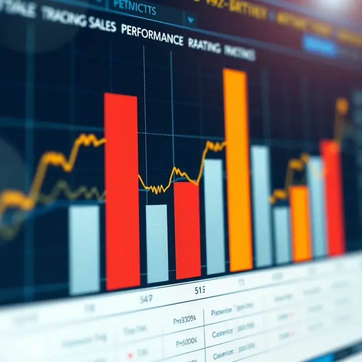
Line charts shine when you want to track changes over time. Investors watch line charts closely to identify market trends, such as the rise or fall of the Sensex over the fiscal year. Because line charts connect data points with continuous lines, they highlight upward or downward trends as well as fluctuations easily. For example, an analyst tracking crude oil prices might prefer a line chart to see how prices evolved week by week, giving signals for buying or selling.
Pie charts offer a clear visual of parts making up a whole. They are ideal to represent portfolio allocation among sectors: finance, IT, pharma, etc. However, pie charts lose usefulness when the number of segments grows beyond five or six; the chart becomes cluttered then. Using pie charts lets investors quickly spot which segment dominates or if diversification is balanced. Keep colours distinct and the slices labelled for clarity.
Scatter charts help in spotting correlation between two variables. For instance, an analyst might plot market cap against quarterly earnings to see if bigger companies are generating proportionate profits. Area charts are an extension of line charts, filling the space under the curve to emphasise volume or cumulative data, useful when tracking cumulative sales or market share over time.
Radar charts, though less common, provide a multi-dimensional view. Investors looking at different performance metrics of several stocks—like P/E ratio, dividend yield, ROE—find these charts useful to compare all variables at once on a single chart.
Selecting the right chart type not only clarifies data but also accelerates decision-making—vital for anyone working with market information.
Understanding and applying these chart formats effectively improves how you communicate complex data, giving you an edge in interpreting visual data faster and more accurately.
Understanding how to interpret charts is key for traders, analysts, and investors who rely on visual data to make informed decisions. Charts are a powerful tool, but their value depends entirely on your ability to read them correctly. Misinterpretation often leads to costly mistakes, so it pays to master the basics of axes, scales, and legends, while staying alert to any misleading visuals. Plus, keeping context in mind ensures a fuller, deeper grasp of the information.
Axes define the framework of a chart. The X-axis typically shows categories or time periods, while the Y-axis measures quantities. Accurate reading means noting the start and end points, units, and intervals of these axes. For instance, a stock price chart over six months should have the time spaced evenly on the X-axis and price values clearly marked on the Y-axis. If the scale is uneven or compressed, it can exaggerate trends. Also, legends clarify colours, symbols, or line types representing different data sets. Without checking the legend, one may confuse which line stands for which stock or commodity, leading to wrong conclusions.
Not all charts present data straightforwardly. Sometimes, charts use truncated Y-axes that start from a value other than zero, making small changes look dramatic. For example, a sales graph starting from ₹90 lakh instead of ₹0 at the Y-axis base can give a false impression of sudden growth. Similarly, 3D charts or overly complex designs may clutter information, distracting from the real message. Always question whether the chart’s design might be spinning the story. Cross-verifying numbers or switching to simpler charts like line or bar charts can help spot exaggerations or hidden details.
"When a simple bar chart tells a clearer story than a flashy 3D pie chart, trust the simplicity—especially if your investments are on the line."
Even a perfectly designed chart can mislead if you ignore context. For example, a dip in market volume during festival months like Diwali or Eid might be normal due to trading holidays or reduced activity, not a sign of market distress. Similarly, knowing the broader economic or political environment can explain sudden spikes or drops. Say, an unexpected policy announcement by the Reserve Bank of India (RBI) could instantly impact interest rate trend charts. Always pair chart reading with current affairs and background knowledge. This helps avoid rash decisions based purely on isolated visual ups and downs.
In summary, the ability to interpret charts accurately improves your analysis, reduces risk, and sharpens forecasting. Focus on reading axes and legends clearly, watch out for misleading designs, and ground your understanding in relevant context. With these steps, you can use chart views confidently for investment, advisory, or trading purposes.
Creating charts that suit your specific data and goals is essential for clear communication. Whether tracking stock performance or analysing sales trends, using the right visual tools saves time and offers sharper insights. Tailoring your charts to your audience and purpose helps avoid confusion and makes your data more actionable.
Picking the correct chart type depends on what you want to highlight. For example, if you want to compare quarterly profits across different regions, a bar chart works well. Line charts capture stock market trends over months, while pie charts suit showing market share proportions. Avoid forcing data into an unsuitable format; mismatched charts can mislead and hide key messages.
Consider data volume too. Large data sets like daily price movements over a year fit better with line or area charts rather than pie charts. For relationships between two variables, scatter plots reveal clustering patterns or correlations clearly.
Keep your charts simple but meaningful. Use colours consistently: red for losses, green for gains, blue for stable values. Indians often relate to these colour cues intuitively, especially in financial contexts. Avoid too many colours—they clutter the view and confuse readers.
Labelling should be clear and concise. Axes need readable scales and units, for instance, ₹ crores for sales or percentages for growth rates. Include legends only if necessary, and place them where they don't obscure data points.
White space matters. A cramped chart feels overwhelming; spacing elements generously allows the eye to rest and improves understanding. Above all, let the data speak—avoid decorative elements that don’t add information.
Several user-friendly tools are popular among traders, analysts, and advisors in India. Microsoft Excel remains a top choice for quick charting with powerful formula support. For more dynamic charts, Tableau and Power BI offer interactive dashboards that integrate well with Indian data sources.
Open-source tools like Python’s Matplotlib and Seaborn libraries gain traction among data professionals wanting customisation. Indian fintech firms also use platforms such as Zerodha’s Kite or Angel Broking’s SmartAPI, which provide built-in charting for stock analysis.
Many prefer mobile apps like Google Sheets or Zoho Analytics for on-the-go visualisation. These tools support key chart types and often sync seamlessly with cloud storage, convenient for today's fast-paced workflow.
Choosing and designing charts thoughtfully helps you cut through the noise and focus on what matters most in your data. A well-made chart can be the difference between confusion and clarity in decision-making.
Charts have become essential tools for decision-making in business and education. They help simplify complex data sets, making trends and patterns easier to spot. This section explores practical ways charting views support tracking sales, market trends, academic analysis, and improving presentations.
In business, charts provide a clear picture of sales figures and market trends over time. For instance, monthly sales data displayed with a line chart helps identify peak seasons and dips quickly. Bar charts can compare performance across regions or product lines, revealing which products need more focus. Companies often track their Key Performance Indicators (KPIs) using dashboard visuals, offering real-time updates that help managers act promptly. For traders and investors, candlestick charts and volume histograms offer insights into market behaviour, aiding trading decisions.
Academics rely on charts to interpret research data and present findings clearly. Scatter plots help examine correlations, say between hours studied and exam scores, while box plots reveal the distribution and outliers in test results. Educational institutions analysing student performance across subjects use heatmaps to study patterns at a glance, identifying where intervention might be required. This visual approach streamlines the interpretation of complex data, saving time and reducing errors in analysis.
Using charts in presentations and reports boosts understanding and retention. Visual data breaks monotony and makes points memorable, especially for busy stakeholders like board members or clients. For example, a pie chart displaying market share during a stakeholder meeting effectively highlights company position versus competitors. Labelled and well-coloured charts add professionalism and clarity, ensuring viewers grasp insights without struggling through raw numbers. Effective use of visuals can persuade decision-makers by showing evidence simply and convincingly.
Clear and purposeful charting transforms raw numbers into actionable insights. It helps business leaders and educators make informed choices swiftly with confidence.
By applying appropriate charts tailored to their data and audience, professionals will find communicating complex information easier and more impactful. From monitoring sales trends to analysing academic results and enhancing reports, charting views are powerful allies in data-driven environments.
📈 Learn to spot and trade range markets smartly! Understand key traits, tools, and strategies, plus how these differ from trending markets for savvy trading.

Explore Qutex in depth: understand its definition, features, practical uses, benefits⭐ and applications across different fields📊 for smarter tech insights!

Explore Qutex trading basics, tech, benefits, and risks 🤝. Get practical tips tailored for Indian traders aiming to expand their skills 📈.

Explore Qutex Trade 📈: a clear guide to its features, how it works, security, benefits & challenges—ideal for Indian investors seeking smart trading tips.
Based on 7 reviews