
Charting View: Mastering Visual Data Insights
📊 Learn how to choose and interpret charts for business, education & daily data analysis. Avoid errors & improve decisions with clear visual data representation techniques.
Edited By
Sophie Mitchell
Advanced charts have become a vital tool for traders, analysts, and investors looking to handle complex data sets efficiently. Unlike simple bar or line graphs, these charts help uncover underlying trends, clusters, and outliers that would be difficult to spot otherwise.
Charts like heatmaps, waterfall charts, and radar charts offer more than just numbers; they communicate stories from data. For example, a heatmap can quickly show days with the highest trading volumes across multiple stocks, while a waterfall chart breaks down profit or loss components, helping brokers understand which factors contributed most.
Using advanced charts in daily analysis supports sharper decision-making. Visualising patterns in stock prices or portfolio performance is easier when complex data is mapped clearly, without wading through spreadsheets. This is particularly useful in volatile markets where investors need to spot shifts and react quickly.
Visual tools like advanced charts turn raw data into actionable insight, aiding you in making informed decisions under pressure.
Practical application involves selecting the right chart type based on the data and your goal. A radar chart works well for comparing multiple variables, such as different financial metrics across companies in a sector. Meanwhile, a bubble chart can plot variables like market cap, revenue, and profit margins simultaneously for a portfolio overview.
Beyond selection, understanding how to read these charts is key. Analysts must interpret what colour gradients, sizes, or axes represent to avoid misleading conclusions. Training and familiarity with software like Microsoft Excel, Tableau, or Power BI can enhance this skill.
In this article, we will break down common advanced charts, their usage, and practical steps to create and interpret them. Whether you monitor Sensex trends, assess investment risks or track commodity prices, mastering these visual tools will add clarity to your data analysis.
Next, we’ll explore specific chart types and examples relevant to business and research contexts.
Advanced charts play a significant role in today’s data-driven environment, especially for traders, analysts, and investors. Unlike basic charts, which typically show simple trends or comparisons, advanced charts offer deeper insights by handling complex and large datasets. For example, a trader tracking multiple variables like price, volume, and market sentiment might find a radar chart more useful than a line chart to view all aspects at a glance.
Basic charts such as bar graphs, line charts, and pie charts provide a straightforward view of data, often focusing on a single dimension or simple comparisons. For instance, a bar chart displaying daily sales figures helps identify peak days easily. However, when data involves multiple variables, time series, or hierarchical relationships, these simple charts fall short. Advanced charts step in by allowing richer visualisation — like waterfall charts that track cumulative changes over time, or heatmaps highlighting density or patterns in massive datasets.
Advanced charts typically offer multi-dimensional views, interactive elements, and the use of colour gradients or shapes to encode complex information. Features like zooming, filtering, and dynamic layering help users explore data from different angles. These charts enable the identification of correlations, anomalies, and trends that might remain hidden in basic charts. For example, traders can use funnel charts to identify drop-offs in sales or leads through stages, gaining clear insights into the sales pipeline.
Modern data sets can be enormous, with multiple variables and frequent updates. Advanced charts are designed to manage this complexity without overwhelming the viewer. For example, financial analysts working with quarterly reports involving multiple revenue streams, expenses, and market factors benefit from tree maps, which visually break down proportions in a compact space. This helps them pinpoint areas needing attention without scrolling through pages of data.
An effective chart does more than just show numbers; it tells a story. Advanced charts use visual cues like colour, size, and layout to guide the viewer’s eye and emphasize important points. In stock market analysis, a heatmap coloured by daily price movement can instantly show which sectors are performing well or poorly. Good data storytelling helps investors make quick, informed decisions by highlighting key trends and underlying causes clearly.
Advanced charts bridge the gap between raw data and actionable insights, enabling professionals to move beyond numbers and understand their significance in context.
By mastering these charts, analysts and investors gain a competitive edge, turning complex data sets into clear, decisive information.
Advanced charts offer diverse ways to display complex data clearly, helping traders, analysts, and investors capture insights fast. Knowing the different chart types and their uses allows you to pick the right visual for your specific data story. Let's explore some key advanced charts and where they fit best.
Heatmaps use colour gradients to show the intensity or density of values across a grid or map. This helps in easily spotting clusters, hot spots, or variations at a glance. Tree maps, meanwhile, break down data hierarchically into nested rectangles sized by a metric such as sales volume. Both provide powerful visual cues on how values spread across categories or regions without requiring the viewer to sift through raw numbers.
For example, a heatmap displaying daily stock trading volumes across months helps identify which days saw high activity. Similarly, a tree map of sector-wise market capitalisation quickly shows which sectors dominate the market.
In sales analysis, heatmaps are ideal for tracking customer footfall or transaction frequency in stores across different cities. Retail chains use them to optimise inventory by location and time.
Financial analysts deploy tree maps to break down portfolios by asset classes, making it easier to monitor exposure and diversification. Banks can also spot loan defaults by geography using heatmaps of risk scores.
Radar charts, also called spider webs, plot multiple variables on axes radiating from a common centre. They let analysts compare several dimensions simultaneously, making it easy to see strengths and weaknesses or differences across comparable entities.
For instance, comparing financial ratios like return on equity, debt-equity ratio, and profit margin for different companies on a radar chart clearly highlights areas where one firm outperforms another.
Radar charts find strong use in performance appraisals, where employees are evaluated across skills such as teamwork, punctuality, productivity, and problem-solving. Managers can visualise gaps or improvements at a glance.
Investment advisors also use radar charts to evaluate funds across risk, returns, expense ratios, and other criteria, helping investors choose suitably balanced portfolios.
Waterfall charts display sequential positive and negative values, helping trace how an initial value changes to a final one through several steps. This makes them suited to track profit and loss statements or cash flow movements.
Funnel charts, on the other hand, visualise stages in a process with shrinking widths, useful for conversion rates or drop-offs.
Sales teams apply funnel charts to monitor lead progression—from prospects to closed deals—quickly identifying where most dropouts happen. This helps focus efforts on improving weaker pipeline stages.
Finance professionals use waterfall charts to break down the impact of different expenses and income sources on net profit, providing transparency on how each element affects the bottom line.
Choosing the right advanced chart depends on the data type and the insight you want to highlight. Heatmaps reveal patterns of density, radar charts compare multiple factors, while waterfall and funnel charts clearly track changes over time or stages.
Understanding these charts helps industry players convey complex data in accessible ways, resulting in quicker, better decisions in trading, advising, and investment management.
Creating advanced charts bridges the gap between complex data and clear understanding. To make these charts truly effective, you need reliable tools and the right approach to data preparation. Good tools simplify the chart creation process, while careful data management ensures your visuals communicate accurately without confusion.
Microsoft Excel remains a favourite among analysts and traders for creating advanced charts, thanks to its wide availability and comprehensive features. Beyond simple bar and line charts, Excel supports more complex visuals like waterfall charts, radar charts, and heatmaps through built-in templates or add-ins. Its PivotChart feature lets you summarise large data sets quickly, maintaining flexibility when filtering or drilling down. For example, a stock broker can use waterfall charts in Excel to display cumulative gains and losses across portfolio segments effortlessly.
Excel also allows customisation for clarity and emphasis. You can adjust axis scales, apply conditional formatting for automatic colour coding, and insert dynamic slicers to filter data in real-time. Such controls make it easier to explore scenarios and spot trends fast, which is critical in trading and investment decisions.
Google Sheets offers a cloud-based alternative with collaborative benefits. While its advanced charting features are somewhat less extensive than Excel's, Sheets shines by enabling multiple users to update and analyse data simultaneously. This is useful for teams monitoring market indicators or sales performance across locations.
Besides spreadsheets, popular Business Intelligence (BI) tools like Tableau, Power BI, and Zoho Analytics enable creation of highly interactive and visually rich advanced charts. These platforms connect directly to databases or Indian financial data sources, allowing real-time dashboard updates. Analysts can blend diverse data sets, apply complex calculations, and create custom visuals that adapt to user queries. For example, financial advisors use Power BI dashboards to track Nifty 50 index movements alongside sector-wise performance, all within a single interactive view.
Effective charts start with clean, well-organised data. Removing duplicates, correcting inconsistencies, and filling missing values prevent misleading visuals. For instance, inconsistent date formats could skew a time series analysis of share price movements.
Data should be arranged in structured tables where each column represents one variable, and rows represent observations. Clear labelling of headers and consistent units make chart generation smoother and reduce errors during interpretation. For example, when compiling sales data from different Indian states, ensuring all figures use the same currency (₹) and time period helps in accurate comparison.
Choosing the right variables is key to meaningful charts. Too many variables clutter the visual, while missing important ones leaves analysis incomplete. Focus on those that directly impact the insight you want to share, such as volume and price for stock performance or customer segment and purchase frequency for retail analysis.
Scale choice affects readability as well. Indian stock analysts might prefer logarithmic scales to capture wide-ranging market index values effectively, whereas absolute scales work better for monthly revenue data.
Always tailor your variables and scales based on the question at hand and the audience's familiarity with the data.
Proper preparation combined with suitable tools leads to advanced charts that not only look good but help you make smarter, faster decisions in trading and advisory roles.
Interpreting advanced charts effectively is the key to unlocking meaningful insights from complex data sets. For traders, analysts, advisors, investors, and brokers, it goes beyond simply looking at numbers — it involves understanding the subtle visual cues that reveal trends, patterns, and anomalies. This section focuses on techniques to read and extract information correctly, ensuring data-driven decisions are based on accurate comprehension rather than surface impressions.
Reading colour gradients and shapes is fundamental to deciphering advanced visualisations like heatmaps or tree maps. Colour intensity usually reflects density or magnitude, making it easier to spot areas of high activity or importance at a glance. For example, in a sales heatmap of Indian retail outlets, a darker shade might quickly indicate regions with the highest revenue during festive seasons. Shapes also convey critical details—larger blocks in tree maps represent higher values relative to others, helping you prioritise focus areas.
Spotting anomalies and outliers involves recognising data points that break from established trends. This skill is crucial when reviewing charts like waterfalls or scatter plots. For instance, if analysing stock performance over a quarter, a sudden spike or drop can signal crucial events such as policy changes or market disruptions. Identifying such outliers early allows you to investigate causes rather than treat all data as equally reliable, fostering proactive advisory or investment strategies.
Misleading scales and axes can distort the reality behind your data if not carefully monitored. Some charts may use non-zero baselines or inconsistent intervals, exaggerating or downplaying changes. For example, a line chart showing Nifty 50 index movement might appear volatile if the Y-axis skips values. Always verify the axis scale before drawing conclusions to avoid costly mistakes in trading or risk assessment.
Overcomplicating visuals happens when too much information is crammed into a single chart, making it hard to interpret. Overuse of colours, overlapping shapes, or excessive data points can confuse rather than clarify. When handling large datasets, break down information into multiple focused charts instead of one cluttered visual. Clear, simple charts help you and your clients grasp insights quickly, speeding up decisions and reducing errors.
Thoughtful interpretation of advanced charts not only improves analytical accuracy but also enhances communication of findings and recommendations. Avoiding common pitfalls like distorted scales or cluttered visuals ensures you extract real value from every chart you analyse.
Advanced charts play a significant role in interpreting large and complex data in India’s growing economy. These visual tools help traders, analysts, and advisors break down intricate information into understandable patterns, which supports decision-making in both private and public sectors.
Advanced charts are vital for capturing the fast-changing dynamics of India's retail and e-commerce sectors. For example, heatmaps can highlight regional sales variations across cities, helping companies like Flipkart or Amazon India adjust inventory and marketing strategies during festive seasons such as Diwali or the Great Indian Festival. Radar charts allow businesses to compare multiple product categories, tracking performance across states and consumer segments simultaneously. This deep insight into customer behaviour and supply chain efficiency explains sudden spikes or drops more clearly than basic line or bar charts.
Financial analysts in India rely on charts such as waterfall and funnel diagrams to detail profit and loss sources or capital flows in annual reports. These charts expose sequential changes in revenue streams, costs, and net profits over quarters, aiding investors on Sensex or Nifty 50 to quickly grasp financial health. The visual breakdown reduces complexity and highlights points demanding further scrutiny, such as unusual expense surges or revenue dips. Automated charting tools in software like Excel, Tally, or Zoho Books integrate well with Indian accounting practices, making financial reporting more transparent and efficient.
With India's diverse and growing population, advanced charts illustrate demographic shifts more effectively than tables. Tree maps, for instance, can represent age-group distributions across states while layering economic factors such as literacy or employment rates in one view. Such visualisation aids policymakers in prioritising resources for education, health, and rural development. For example, census data from 2011 to recent surveys can be compared using animated time-series charts to track urban migration or growth of specific communities in metros like Mumbai, Bengaluru, or Hyderabad.
During the pandemic, advanced charts proved invaluable for managing the crisis in India. Heatmaps showed district-wise infection hotspots in real time, guiding lockdown measures and resource allocation. Funnel charts mapped vaccination progress, highlighting bottlenecks in supply chains or regions lagging in inoculation. Such visuals cut through overwhelming raw data, letting health officials and the public comprehend trends clearly, making timely interventions possible. The power of these charts lies in their ability to translate fast-changing, complex health data into actionable insights.
Using advanced charts tailored to Indian contexts enhances clarity and helps stakeholders — from investors to policymakers — make informed, timely decisions based on compelling data visualisation.
Benefits at a glance:
Track sales spikes during Diwali using heatmaps
Simplify financial flows through waterfall charts
Display census growth patterns with tree maps
Manage Covid-19 with district-wise heatmaps and vaccine funnels
This practical use of advanced charts supports India’s data-driven growth and governance, presenting data not just as numbers but as clear stories to act upon.
📊 Learn how to choose and interpret charts for business, education & daily data analysis. Avoid errors & improve decisions with clear visual data representation techniques.
📈 Explore Ethereum's price today with expert insights! We analyse market drivers, recent news, technical trends & investor sentiment for clear ETH forecasts.
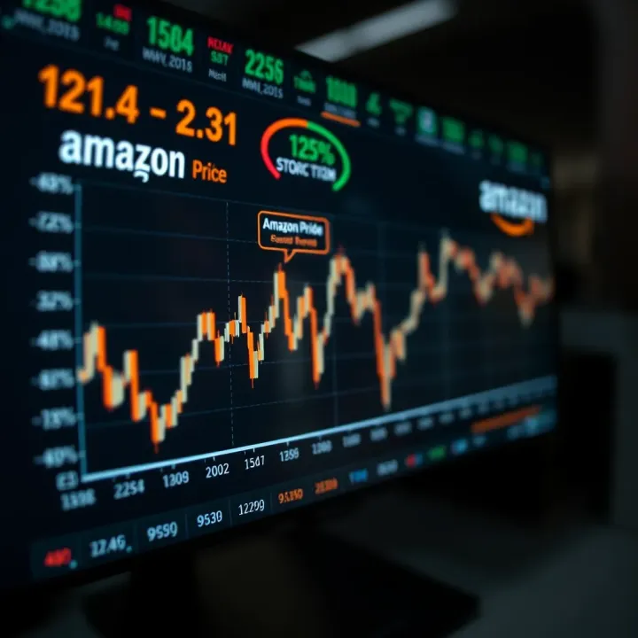
📈 Explore Amazon stock price trends, recent performance, and expert forecasts to understand investment opportunities and risks amid today's dynamic market.

🚀 Explore detailed BTT price prediction, expert analysis, market trends, and investment tips tailored for Indian cryptocurrency enthusiasts looking to make informed decisions.
Based on 10 reviews